Friday, February 24, 2017

Making marks at the seaside

imageFlipping through the BBC directory the other evening, I came across a new art show: The Big Painting Challenge.  A bit like Masterchef, it features a dozen amateur artists who go through weeks of themed challenges, creating works under supervision of two professionals.  Works are judged, someone goes home, the rest hug and advance.

image image

I picked up at Week 2: Landscapes.  Two painting challenges were held in one of my favorite seaside towns, Hastings: one to paint the pier from shore, the other to paint the shore from the pier.  It was lovely to see the red shingle beach, to have walked the pier, to recognise the restaurants and fishing boats (and the jellied eel).

imageThe challenges had possibility.  It was raining as they tried to figure out perspective and detail on the pier,   making a ghastly mess of colours running down the canvases.  It was sunny-foggy-sunny on the pier, as the Coast often is changeable, and artists were encouraged to reduce things to five simple lines and a point of view across the seascape.

imageFor me, things start going wrong with the resident artists,  Pascal seems thoroughly unhelpful, his five-line sketch tracing the details of the rooflines rather than the sweep of the sea and sky.  Diana is a bit better, but sympathetic rather than instructive.

But my biggest issue is with their technical approach to the task.  Tools and methods matter, but it leads to photographic compositions with color added to simulate creativity. 

image image

Instead, look at the seascapes actually presented in front of the painters during the program.

bbc hastings art 1BBC Art 2


How does the landscape make you feel, and what elements provoke that perception? Where is the light and dark; what are the strongest lines running through the scene?  How best to convey that unique and essential sense of Place?

bbc art 3

bbc art 4

The results, however, feel soul-less, given what was on offer.

bbc art 5 bbc art 6

The winning painting had energy and movement, I agreed with the judges on it.

bbc art 7

turner 1But, overall, it makes me long for a Turner (as it did to one of the judges)


‘worth a watch, nonetheless, on BBC iPlayer all month.

Labels:

Sunday, February 5, 2017

Sorting through Stanley Spencer

DSC00816 (1300x867)There couldn’t be greater contrast between the ordered ambiance of Cookham village and the strange life of its most famous inhabitant, artist Stanley Spencer.  At the same time, his inward looking painting and introverted life seems a perfect match for the quiet Thames-side setting.

DSC00822 (1300x867) 

The Stanley Spencer Gallery lies at one end of Cookham’s High Street.  Housed in a repurposed church, fitting his wishes for an appropriate setting, the two-level gallery displays around 30 varied works (the majority of his estate went to the Tate).  I wasn’t really familiar with him prior to visiting, but his art became familiar to the British during the 80’s after several well-received retrospectives.

DSC00812 (890x1300) DSC00813 (1300x867)

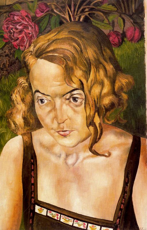
Spencer worked in the early 20th century, World War I and the Depression, crafting oil paintings that look Deco-modernist to me. His life story seems sad and frustrated, shaped both by spiritual convictions and wartime experiences. 

His works, well executed, nonetheless seem inconsistent and contradictory.  A deeply religious man, there’s humorous touches that keeps them light and original (who else has shown the disciple’s feet so prominently at the Last Supper?).

DSC00821 (1300x1028)

Deeply disappointed in love, at once charged and repressed, he painted his personal tensions into grotesque realism.  I doubt that any of his wives thought that his depictions were flattering.

DSC00820 (965x1300) 

He puts a lot of detail into his paintings, but I don’t see the connection to the pre-Raphaelite styles.  He seems to have struggled with drawing hands in the same ways that I once did, graceful fingers angular and gnarled as tree limbs.

But, charmingly, he focused on everyday people: farmers, workmen, infantrymen, and housewives.  A child rifles a drawer from beneath his mother’s skirts; welders put the finishing touches on steel hulls in the shipyards. 

DSC00818 (1300x1043)  DSC00819 (1300x1001)

His landscapes are both flat and deep: punts lining the Thames shoreline, trees sway beyond fields, but all with layered perspective across a vertical composition.

DSC00825 (1300x1003)  image

DSC00815 (867x1300)It’s all good and interesting work, worth a stop to study a unique and eclectic talent.

Labels:

Tuesday, August 16, 2016

Sculptures and Installations

DSC02911Work and travel kept me away from the opening weeks of the Tate Modern’s new extension, the Switch House.  Ten stories set atop The Tanks, the angular brick structure is dedicated to interactive art and video.  It opened to generally positive reviews , and invited members in for a preview ahead of the opening week last June.  This was my first chance to give it aa wander though, entering from the Turbine Hall and then up to Viewing Deck and back down level by level.

DSC02934I can’t say I’m a fan of the new building.  The lowest levels are close concrete caves: dusky lighting, low ceilings, and industrial ambiance.  The exhibitions, corporate sponsorships, feel more like rough ideas than insightful art.  Posted signs warn that the staff will periodically enter to rearrange the blue scaffolds on the floor, emphasizing the rigid transience of the work.  Alcoves conceal flickering video screens, the sparse art overpowered by the heavy architectural elements.

The elevators were inadequate for the flow of visitors, often arriving full or passing completely.  Eventually we got up to the tenth-floor viewing deck, which is spectacular.  The wrap-around balcony gives wonderful views of the city, the river, and the adjacent £15 million+ apartments at Neo Bankside.  (Predictably, the gallery’s heeled neighbors are not too happy)

DSC02935 DSC02936

The floors beneath feel limited and claustrophobic: the slit wrap-around windows pull the spaces in rather than open them up in the Café and the Member’s Lounge.  There’s little space given over to showcasing art and, while I’m sure that the building will grow into it’s purpose, it doesn’t yet feel like an expansion for the museum’s collection.  It is more a working extension of its premises.

-----------------------------------------

Image result for mona hatoumLess time spent in the Switch House translated to more time spent among the sculptures of Mona Hatoum.  A Lebanese . Palestinian artist, she works with installations of everyday objects that play with light, sound, and space.  The Tate’s overview closes in a few days, but I was particularly charmed by her illuminated and motorized works.


DSC02932 DSC02933DSC02928DSC02929

A sand table that creates and erases grooves beneath a rotating arm (+ and –) was nicely executed, as were two works with intricate metal and tonal meshes around flickering lights (Light Sentence and Grater Divide).  Finally, the full-room high-voltage humming of Homebound was fun, both playful and lethal  in depicting domestic confinement and small-scale threat.

Labels:

Monday, August 15, 2016

Not missing the flowers

imageGeorgia O’Keefe is an iconic twentieth century American artist, whose paintings are instantly and uniquely recognizable.  Robert Hughes characterized her as “a ‘natural': not a naive or primitive painter by any means, but one who seemed to be instinctively in touch with the vibrations of the cosmos.”   I’ve visited her museum in Santa Fe, filled with simple, bold depictions of sensualized flowers, bleached bones and southwest landscapes.

The Tate Modern is hosting a retrospective of imageher work, on view through the end of October.  It’s themed as ‘A century of O’Keefe’, celebrating 100 years since her first gallery showing.  We spent a couple of hours exploring the thirteen rooms, nice for not focusing on the expected canvases.  Although there were a few of her recognizable blooms, most of the exhibition has early works that  anticipate the well-known paintings, showing how her methods and vision developed in the early decades of her work.

It also holds a number of photographs by her husband, DSC02913Alfred Stieglitz, that range from insightful (the portrait of her hands, above) to embarrassing (I can imagine him reassuring her that nobody would ever see the bedroom photographs as they were being taken).

DSC02991I really liked her early abstract work in charcoal.  When I took still-life classes, they were very geometric exercises, gridding off spaces and squaring off angles.  Life drawing, in contrast, was all arcs and curves and living shadows: infinitely more appealing.  I see that feeling in works  like No. 12 Special, right.


DSC02992 DSC02994

The organic exploration of edge, contrast and shadow continued through her early watercolours (Pink and Blue Mouuntain) and oils (Abstraction Blue), which almost foreshadow later flowers.  Abstraction – Alexius and Grey Lines with Black, Blue and Yellow were also really striking close up.

DSC02996 DSC02995

The early landscape paintings were nighttime urban canyons , New York rather than Santa Fe.  The liquid clouds and reflections of the moon in the lights are a nice unifying feature, repeated as she works through the ideas.

DSC03000DSC02999

The  realism gave way to full abstraction, soft and pillow-y, full of currents and storms.

DSC03003 DSC03002

And it’s easy to see it all coming together as she discovered the desert Southwest.

DSC03001 DSC03005DSC03004

It’s a lovely show to spend time browsing the works, connecting the styles, and reflecting on her career.  And, in the end, I didn’t really miss the flowers.

‘a bit like seeing beyond the wall of yellow sunflowers  in the van Gogh museum as well

Labels: